Mastering pointed pen uncials with Joy Daniels
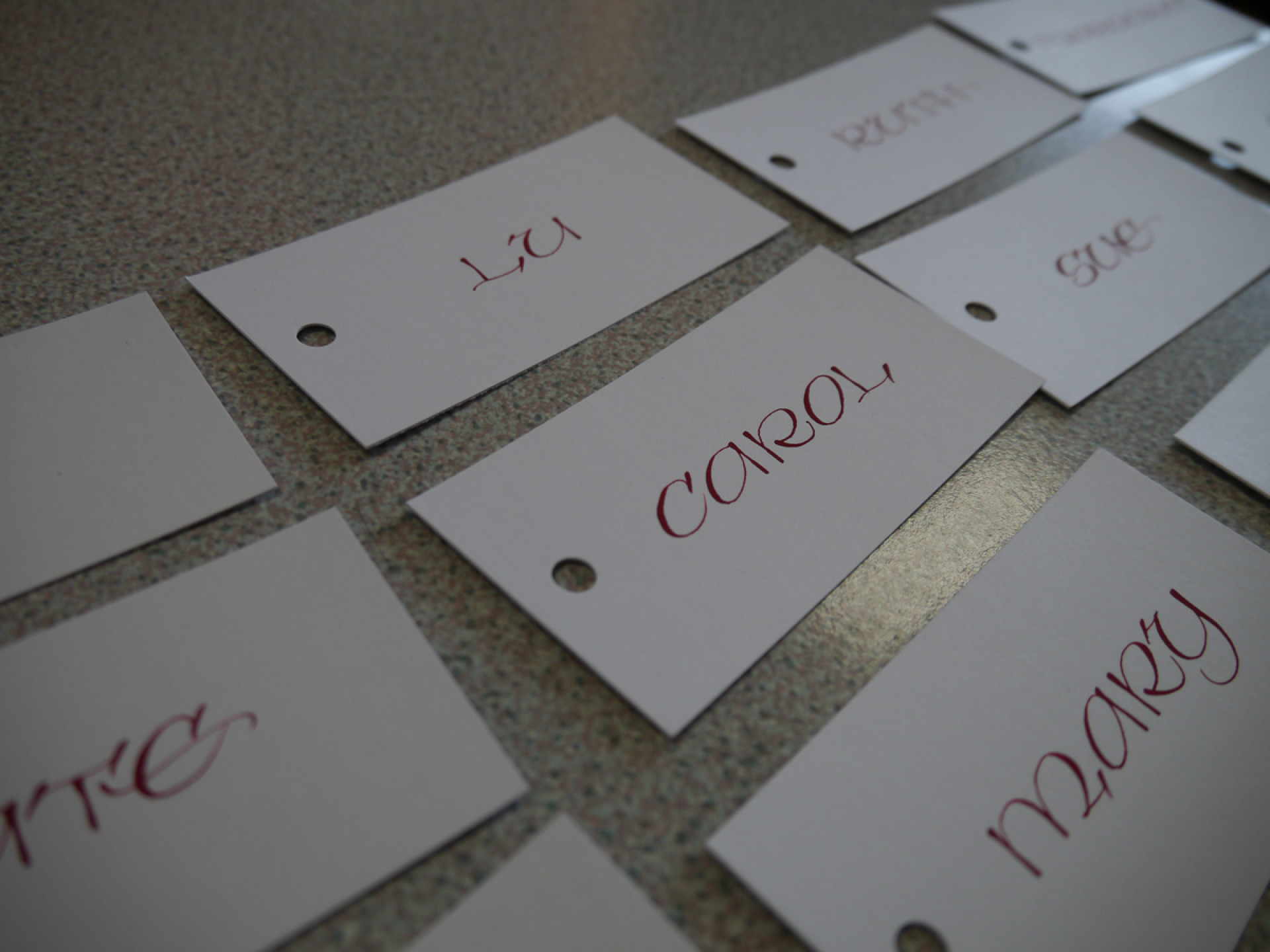
Lettering artist Ruth Rowland shares her experience learning Pointed Pen Uncial at our March 28 workshop with Joy Daniels. This post was originally shared on Ruth’s Google+ account. Follow Ruth’s work via her website, and social media channels: Google+, Facebook and Twitter. Images courtesy of Kate Watson, Olive and Reid.
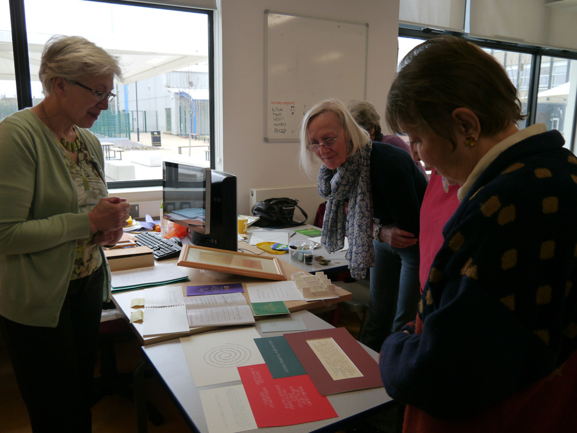
Last Saturday I was lucky enough to attend a workshop taught by Joy Daniels on Pointed Pen Uncial. I enjoyed a Copperplate workshop with Joy last year and relished the chance to do more pointed pen work. That said, I knew very little about Pointed Pen Uncial, other than it must be related to the Uncial we would normally write with a broad edged pen.
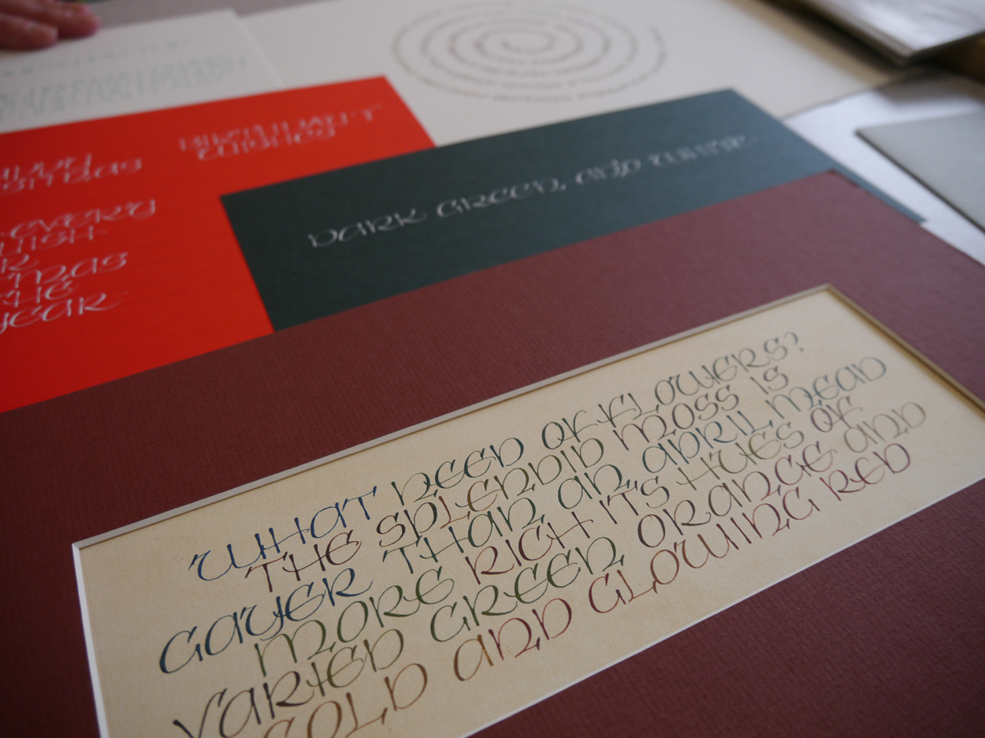
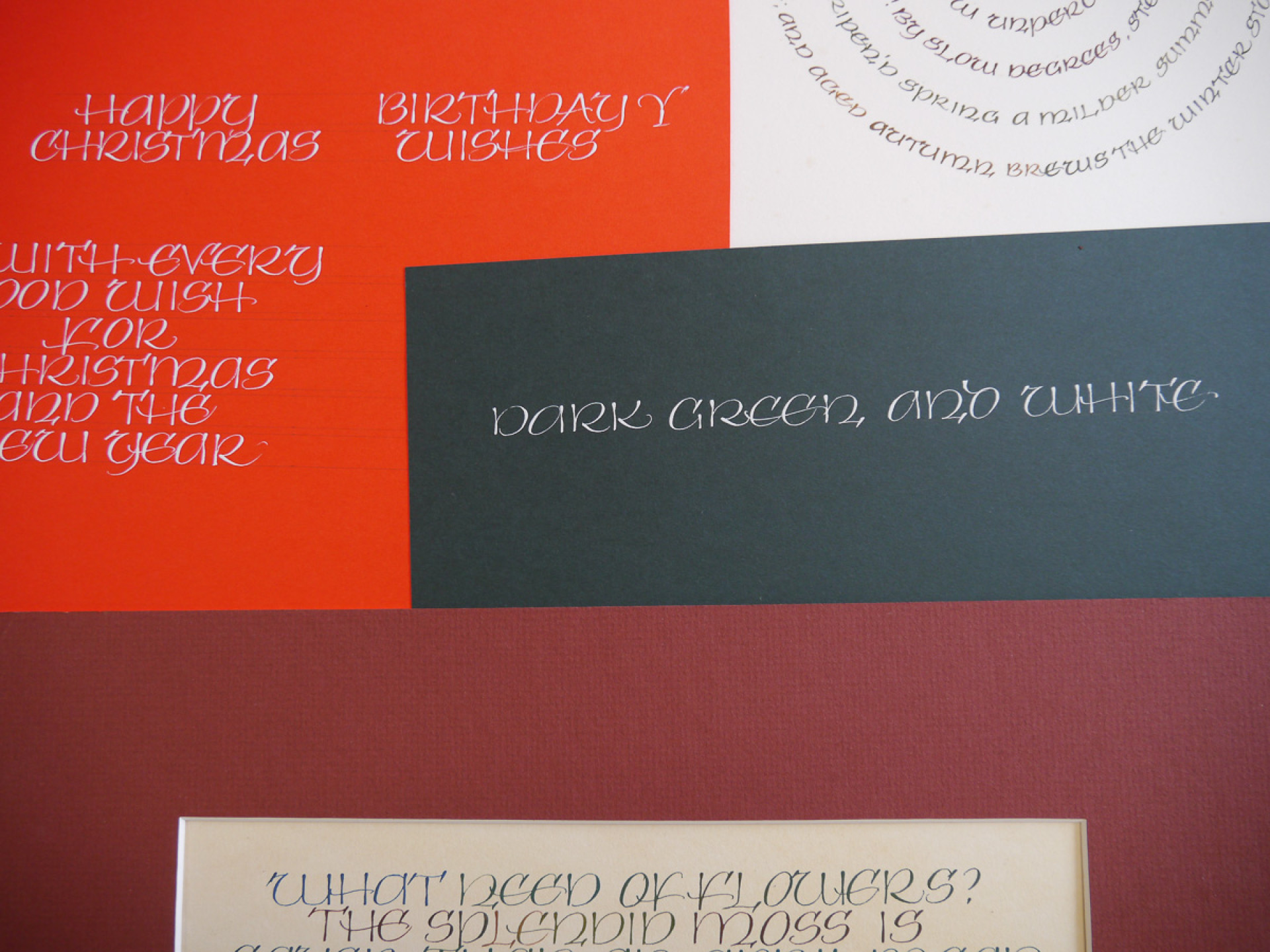
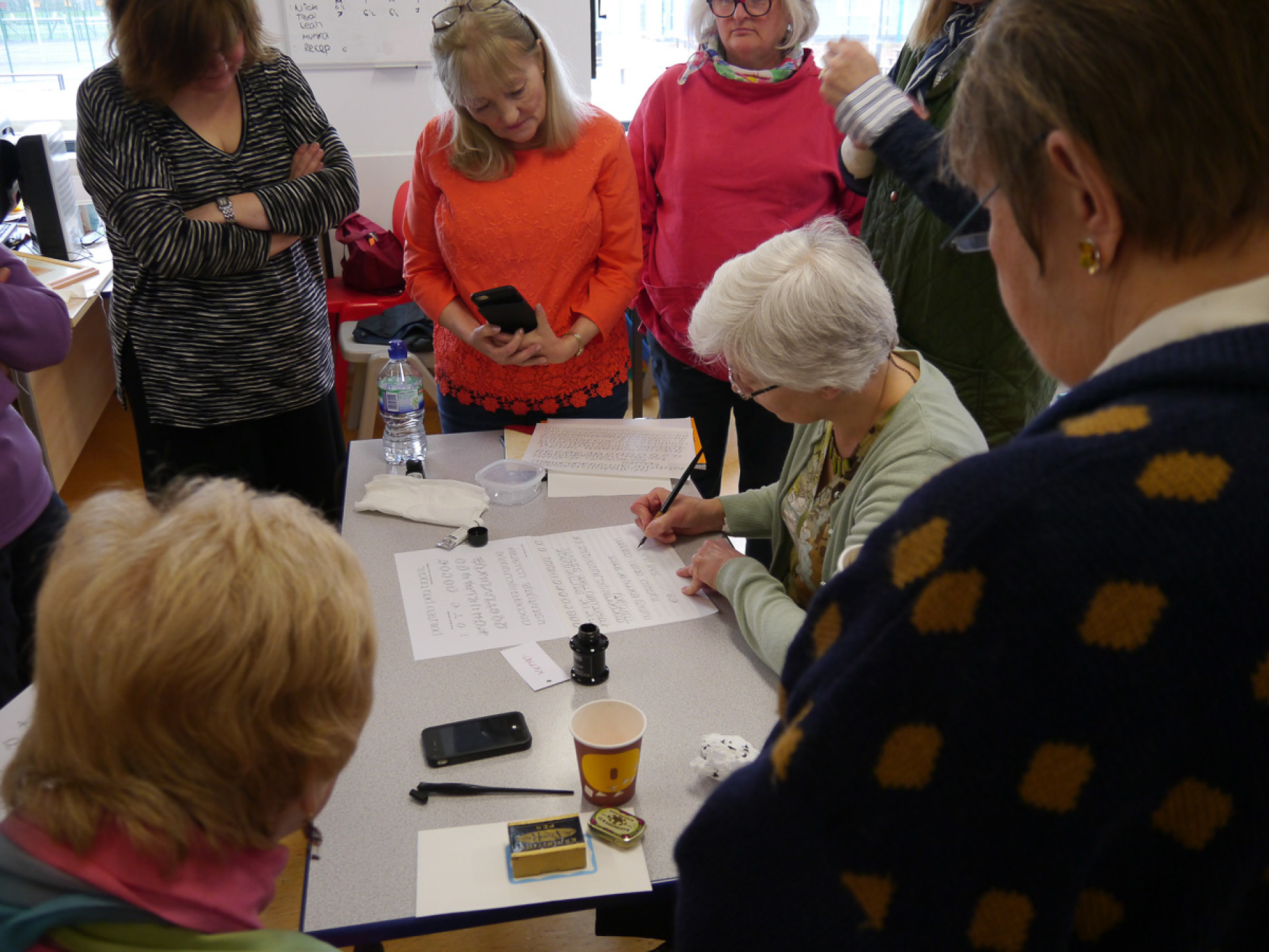
After the usual greetings and chat with this friendly group, we got straight down to work with Joy showing us a good range of samples of the lettering style, both in books and as original artwork by herself and others. She explained that the style was designed by calligrapher, Mike Kecseg. Joy had spotted the lettering in The Speedball Textbook (Fink, J. and Kastin, J.) and contacted him to discuss it. Happy for her to teach it, they talked through details of its creation.
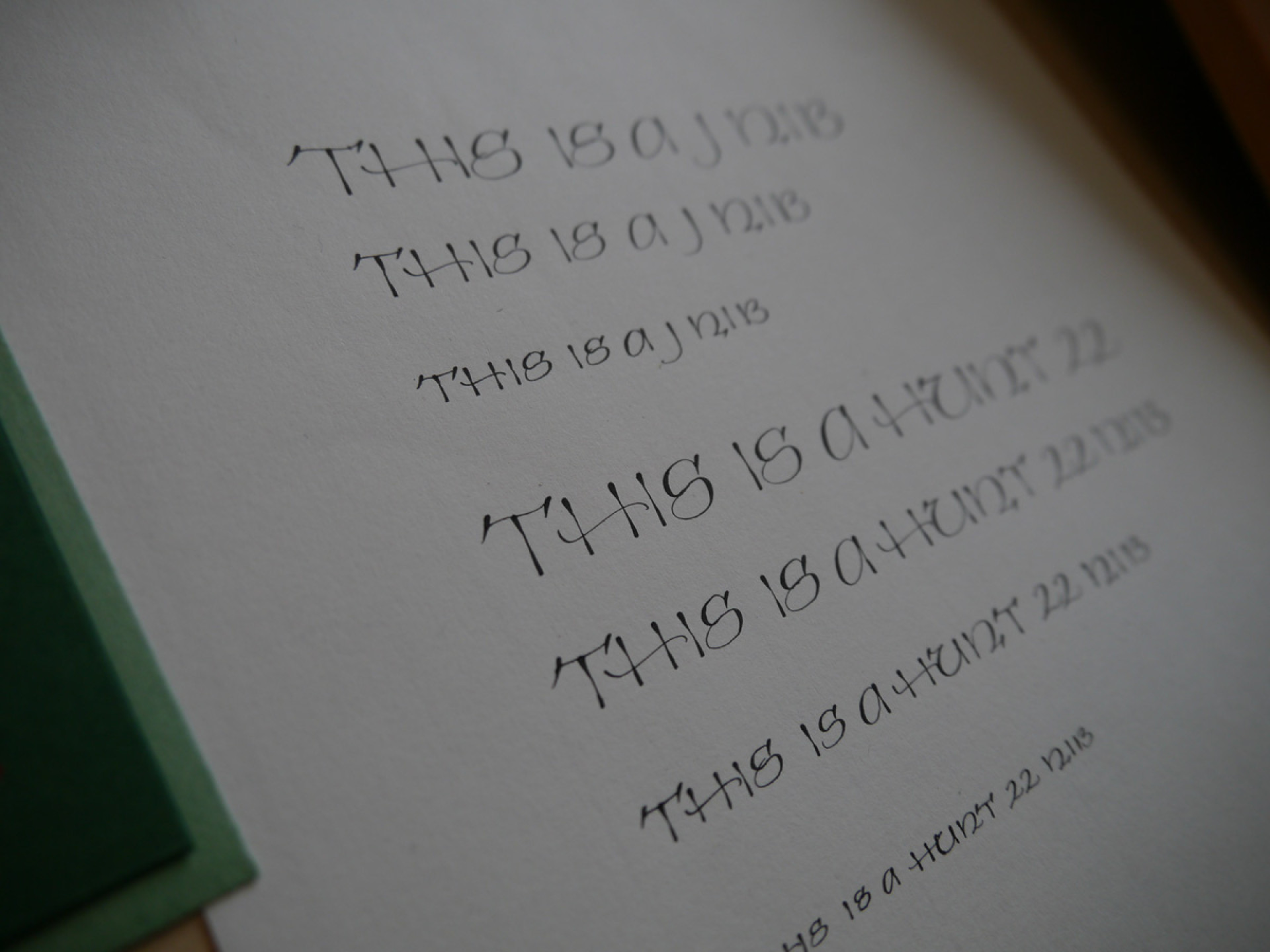
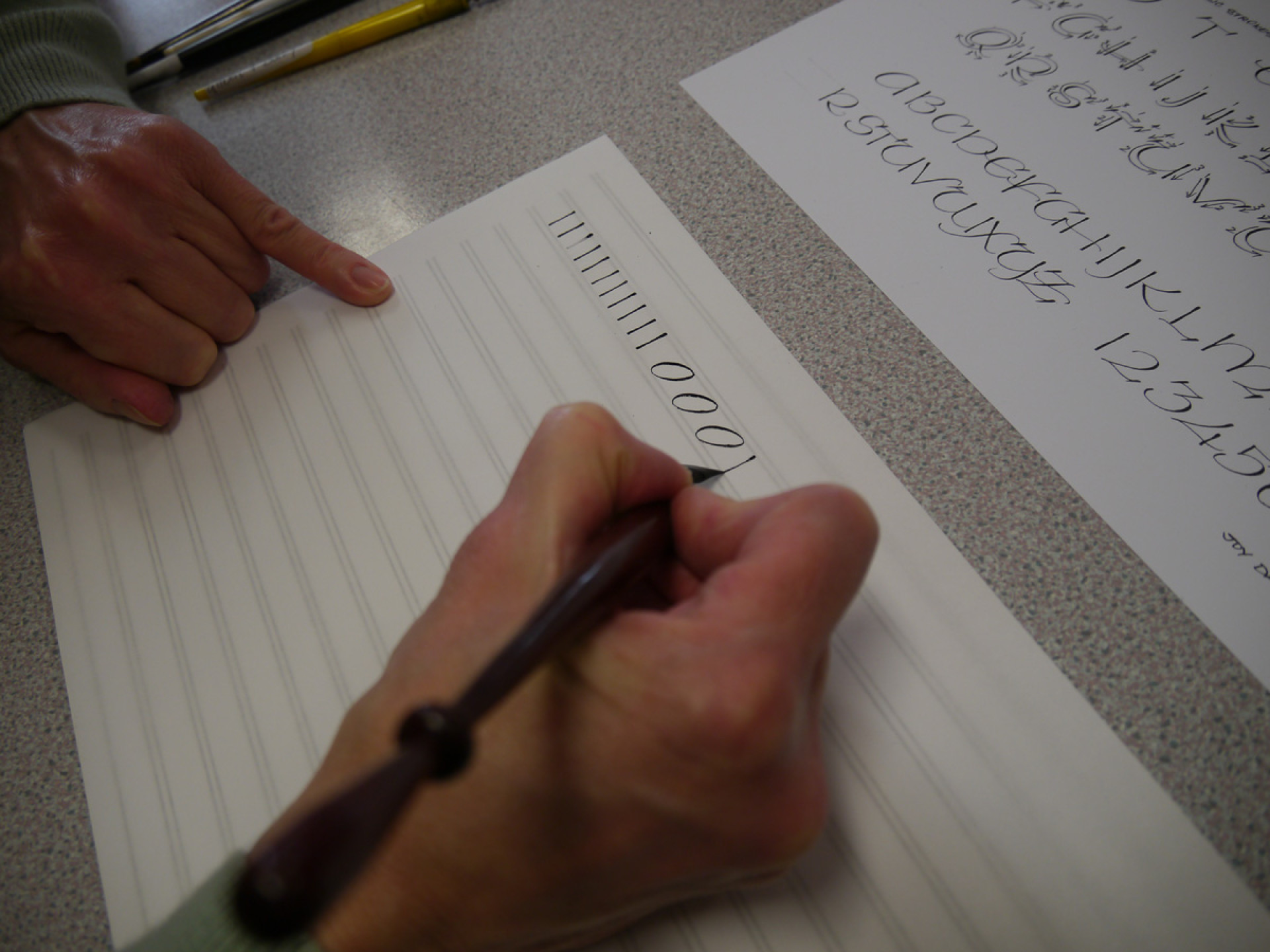
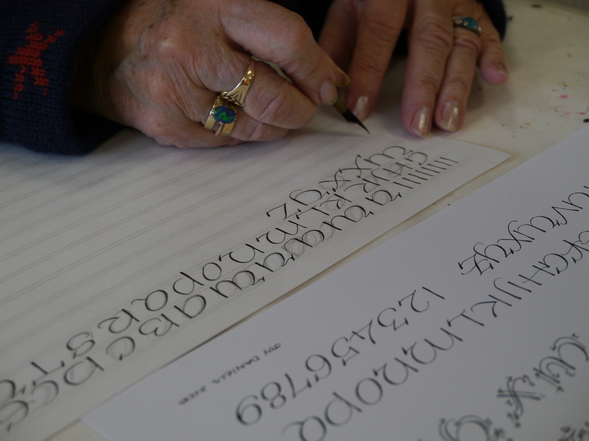
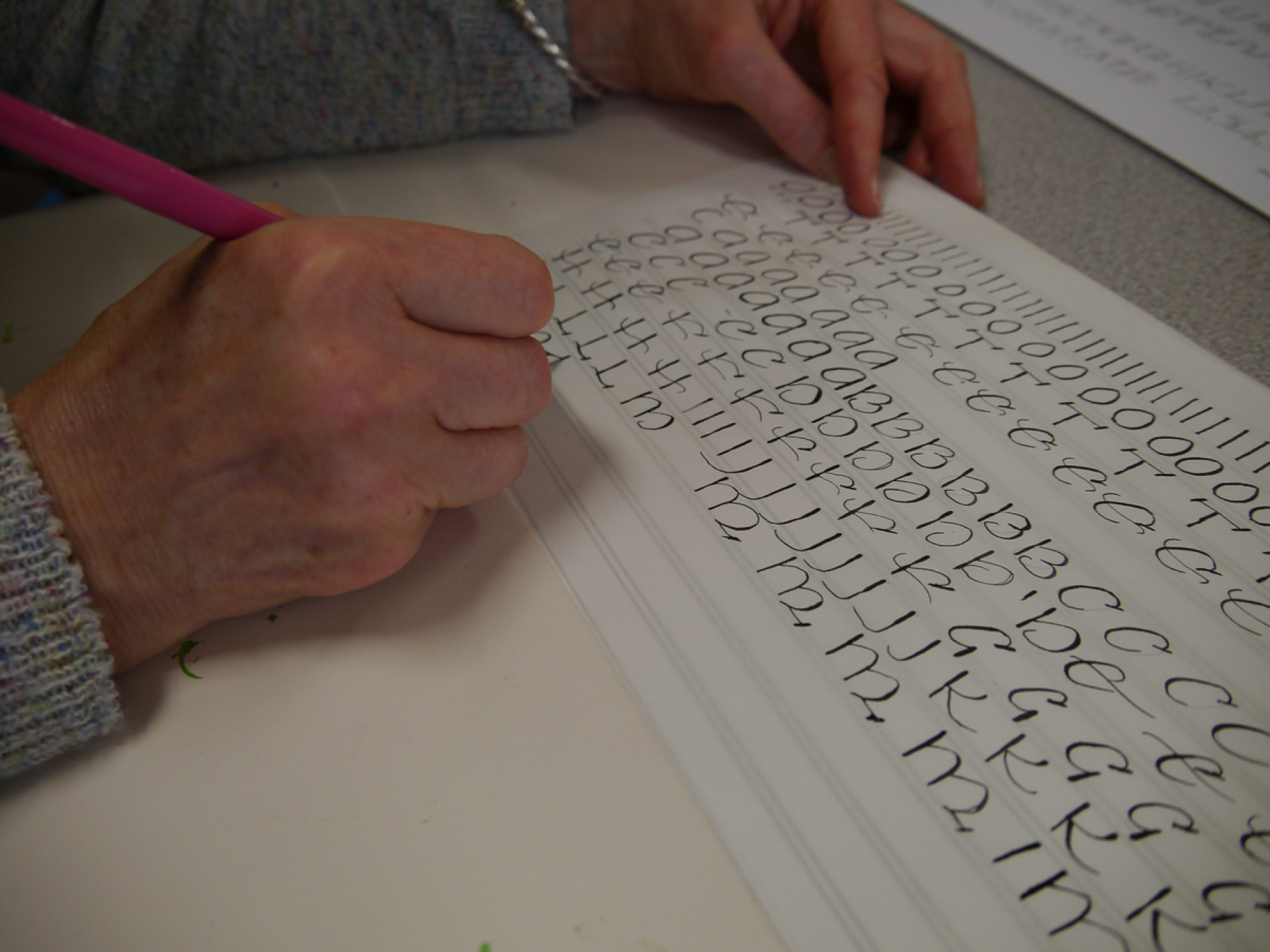
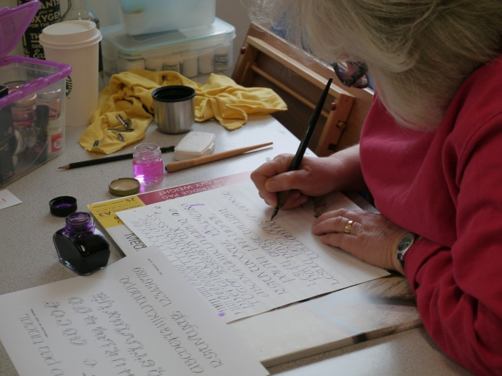
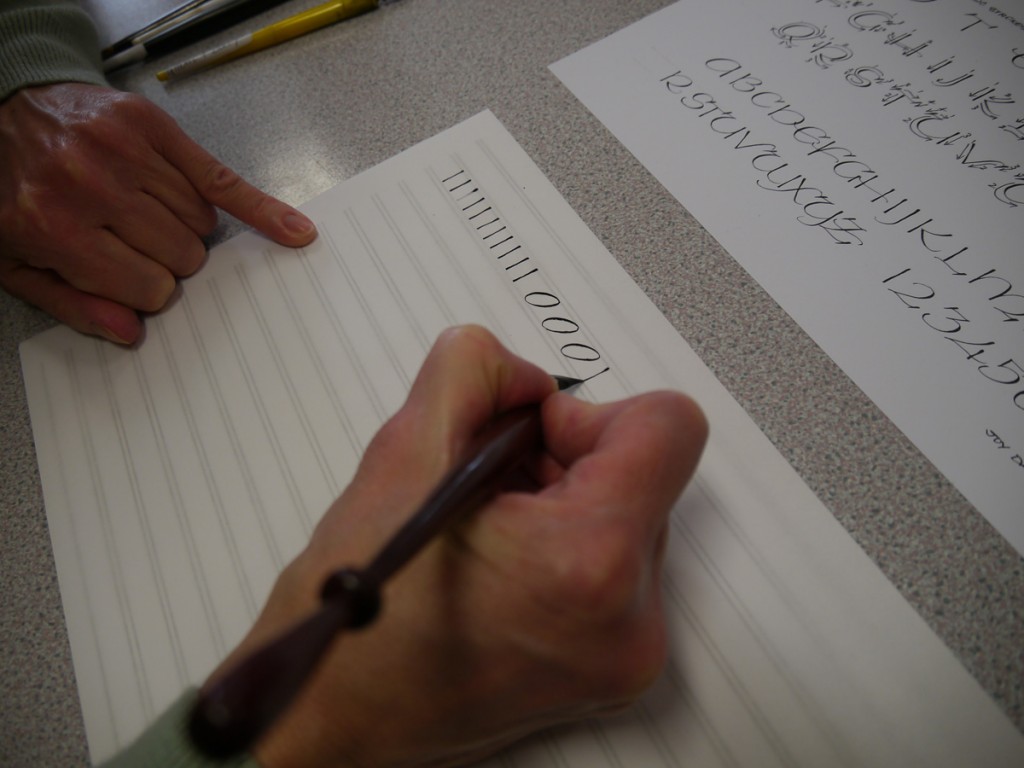
We started our practice with the basic strokes for the form, demonstrated to us by Joy. If you’re comfortable with a pointed pen and are an experienced copperplate writer you will probably master these elementary shapes quite easily. After more demonstration, we then moved on to the alphabet itself, with its unusual combination of straight and angled shapes. Most people struggled to get these consistent and we all found pencilling in a series of underlying ‘O’ shapes helped us control the forms better.
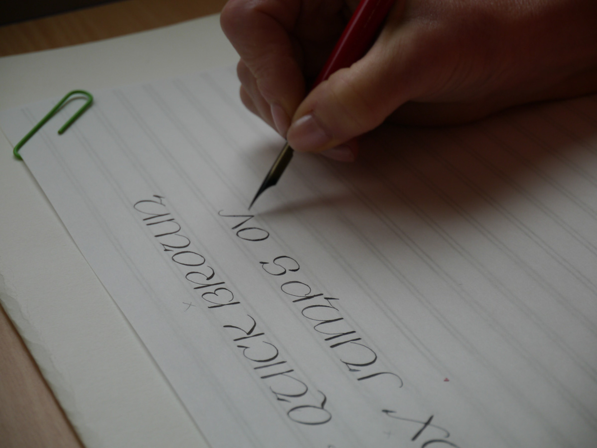
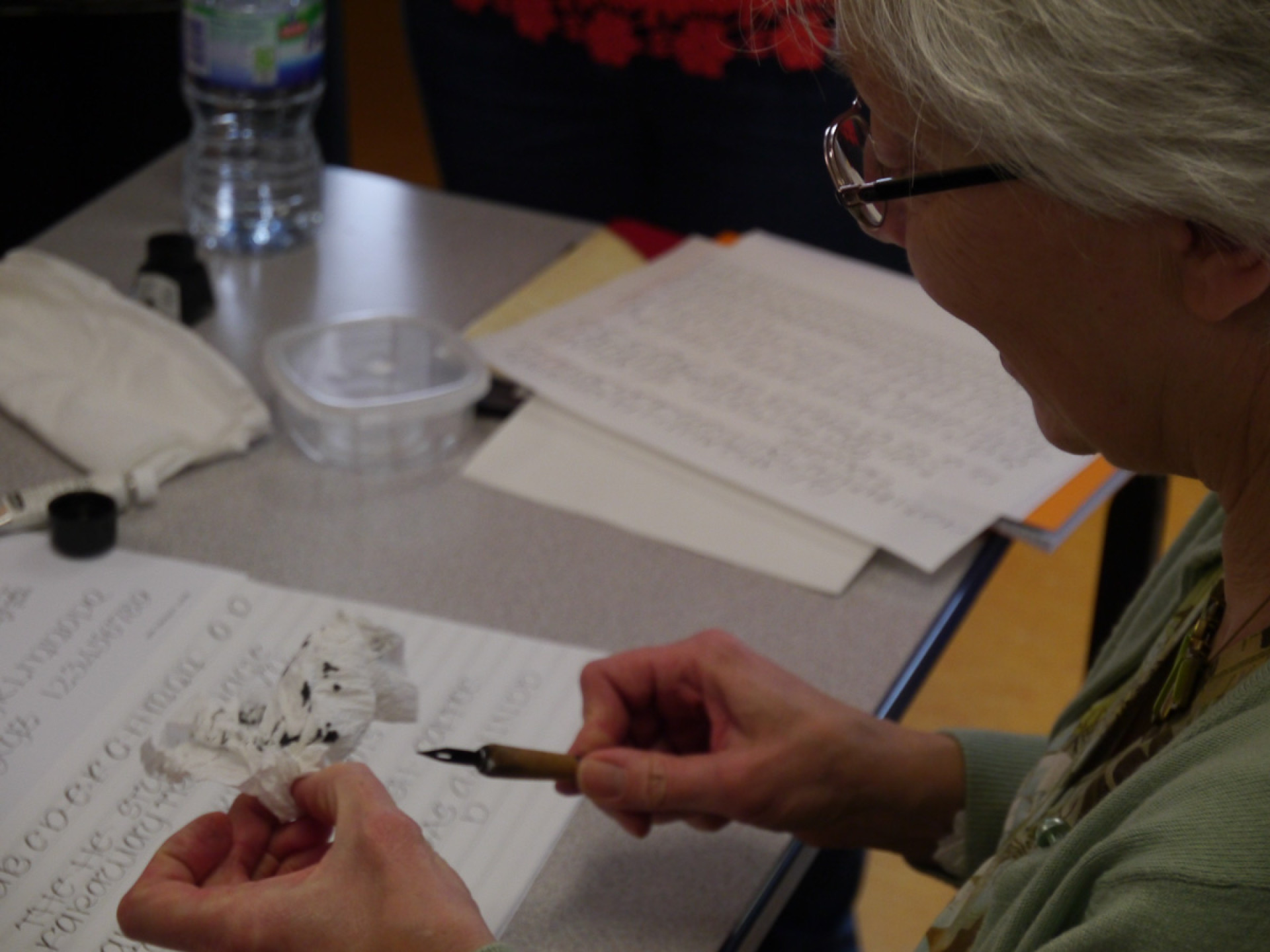
This is a light and delicate style, if you’re heavy handed like me you may struggle to achieve this gossamer touch. Some help from Joy improved my work considerably – she made me a ‘kabab pen’ — don’t worry; it’s calorie free! A small mapping pen nib was taped onto a kabab stick. This instrument is difficult to use: if you don’t want to break the nib, you’re obliged to lift the hand. It’s tricky at first but becomes more of a habit as you progress. I shall certainly be practising with it for all my pointed pen work, as my own lettering is mostly large and gestural, working from the shoulder, so this technique does seem to stop me leaning in too heavily when working from the wrist. If you have this problem too, it’s worth a try, not least because a heavy hand means an aching hand!
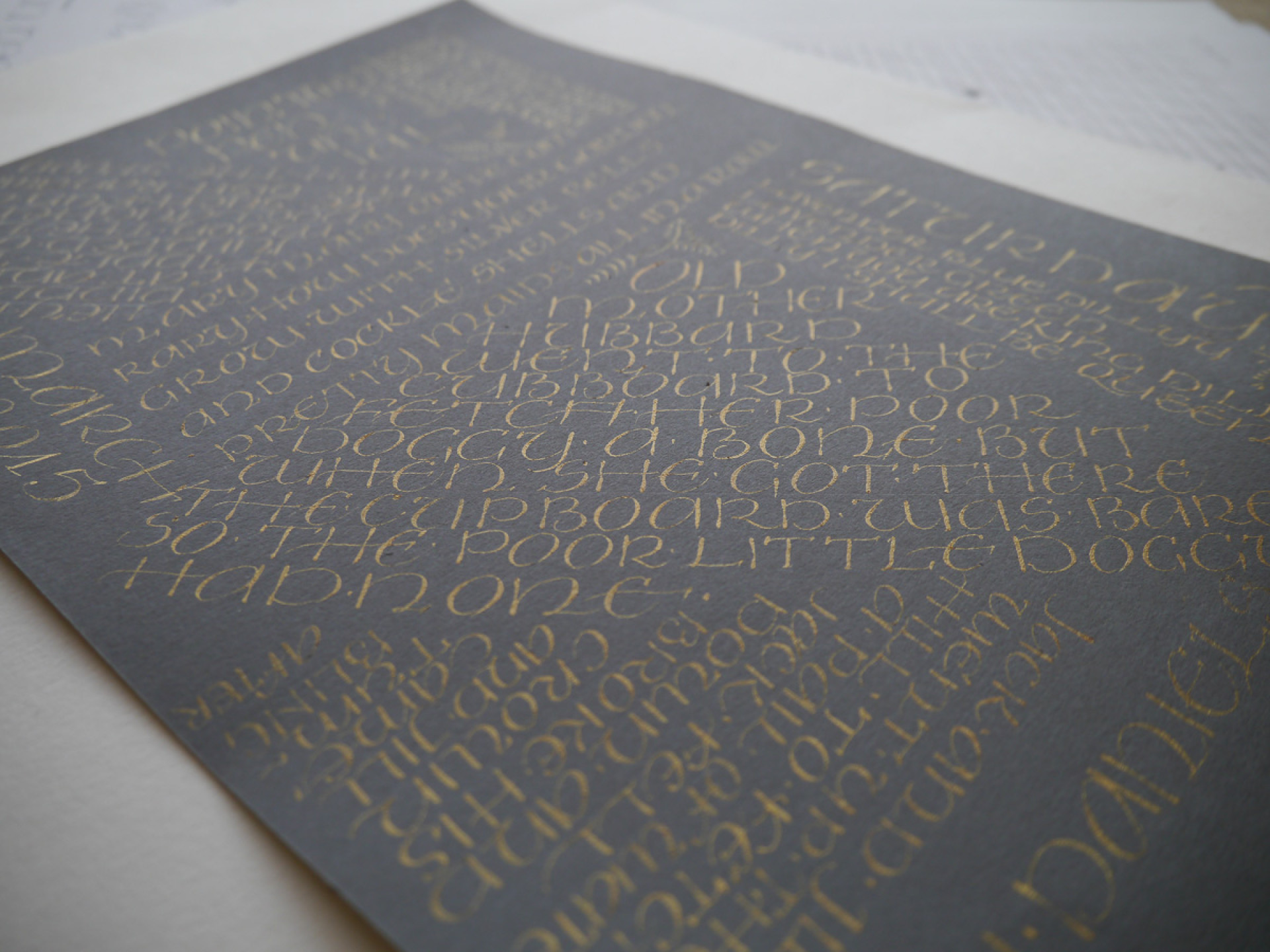
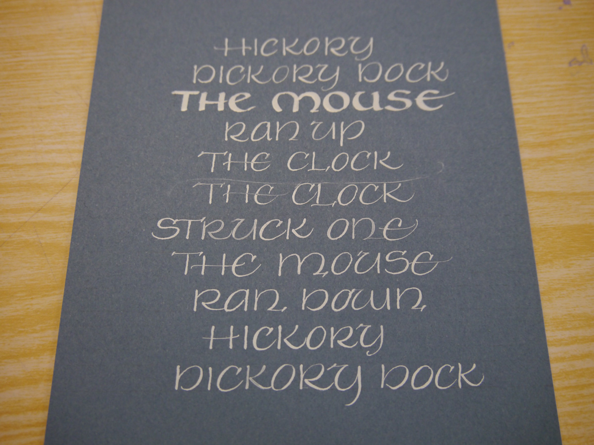
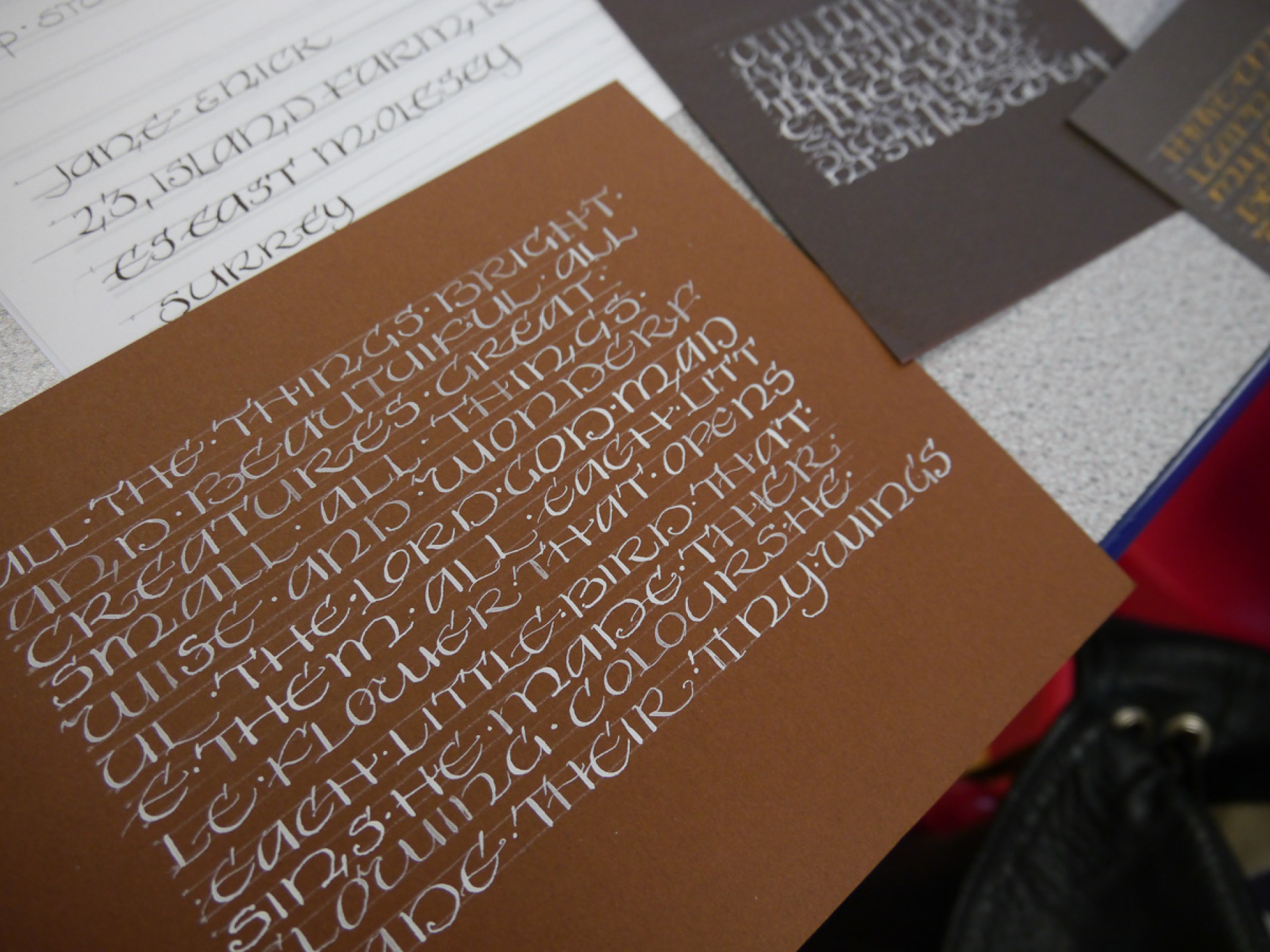
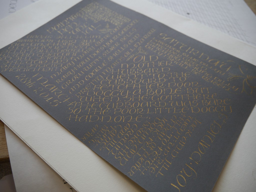
After a relaxed lunch, we experimented with different sizes of script. The style works well in both one consistent size and combining various sizes in a block of text. When spaced tightly it has a thread-like, textural quality. This light, carefree lettering would also work well contrasting with a heavier, bolder letterform. As the afternoon progressed, we went on to experiment with colour and paper, I liked it drawn in light ink on a dark background. Some of the other students tried metallic inks, which I thought were particularly charming, as combined with the delicate ‘press and release’ line weights, it gives a magical, sparkling quality.
In conclusion, this is a light and playful script, it’s easier to master than copperplate, although it still has its challenges. As it’s not a formal script, it’s also open to adaptation to suit your subject, so you could have some fun with variations. Joy’s extensive experience in pointed pen technique and her patient and insightful tuition meant we all felt we had improved by end of day and had a good grounding for further practise.
So, many thanks to Joy and SLLA for another successful workshop. We really are lucky to have these opportunities, not surprisingly the workshops book up fast, so if you’d like to see what all the fuss is about, check out the upcoming SLLA events: you’re sure to find something to inspire!
Ruth Rowland